Boroughs, Blocks, and Immediate Emergencies: A Spatial Relationship?
New York I Love You, But You're Bringing Me Down
Today’s post includes:
How I built my first-ever machine learning model, with mixed success
A look at the relationship between city blocks, boroughs, and whether buildings within them are at risk of experiencing emergencies
Lots and lots and lots of municipal data
Hey there!
Need to convert geo coordinates into useful location information?
This week's edition is sponsored by OpenCage who operate a highly available, simple to use, worldwide, geocoding API based on open data. Try the API now on the OpenCage demo page.
We’ve discussed a lot of heavy topics here at Line of Actual Control recently - airstrikes, Russian military buildups, kids with slingshots - so I figured we’d return to a slightly lower-key topic we’ve explored before: what open data can tell us about the state of New York City’s buildings1.
I figured I’d use this topic to try a technique I’ve had my eye on for a while:
🌟💫🌟Machine Learning🌟💫🌟
Specifically, I wanted to see if a building’s location in a particular block or borough of New York City could predict whether it was at risk of getting hit with what the city calls an “immediate emergency” violation.
What is an immediate emergency? While it’s clearly not good, I couldn’t find the criteria for what exactly makes an emergency “immediate” on NYC’s open data portal. But judging by comments left in building violations files found online, you don’t want your building to get hit with one. They range from worrisome (“unstable retaining wall”) to downright dangerous (“building condemned and demolished”). And I wanted to see if there was a way to predict which blocks were most likely to receive one of these violations.
The only issue: I’m still a relative neophyte when it comes to programming and I’d certainly never built a machine learning model before.2
Let’s learn…about machine learning
(if this doesn’t interest you then skip to the maps in the next section)
Let’s start with the basics: what data to use? First up is the NYC Department of Buildings violations database. It contains location information about buildings that received violations as well as information about the violations themselves.
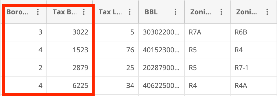
A note about NYC locations: there are five boroughs in the city, each of which is assigned a number: 1 = Manhattan, 2 = Bronx, 3 = Brooklyn, 4 = Queens, 5 = Staten Island. Each of those boroughs contains several thousand consecutively numbered blocks. The first block in Manhattan is therefore 1 0001, while the first two blocks in Queens are 4 0001 and 4 0002, and so on. This numbering system will prove crucial to the final model.
The second dataset is the NYC tax lot database, which contains information about all NYC locations, including their boroughs and blocks.

In broad strokes, my plan was twofold. First, I would train a model on a selection of the boroughs and blocks of buildings that received immediate emergency violations and a selection of the boroughs and blocks of random addresses from the tax lot database to determine if there was some special sauce that separated non-violation locations from violation locations. Then I would feed all city blocks into the model to predict which blocks were most and least at risk of getting an immediate emergency violation.
But first! I needed to harmonize and concatenate the violation and tax lot databases since the model can only run off a single, purely numerical dataset.3
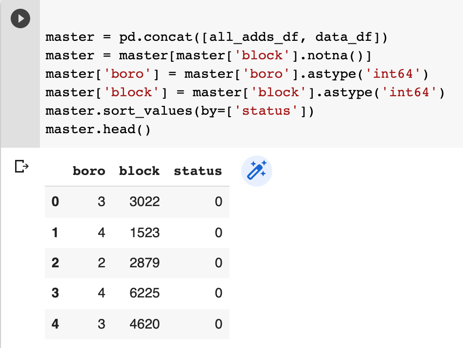
Using the NYC open data portal API, I imported a few thousand lines each of emergency violations data and tax lot data. I added a “status” column to indicate which blocks had emergencies and which didn’t, deleted the unnecessary columns, renamed the remaining ones, smooshed the two datasets together, dropped null values, and ensured the columns were in numerical format. At the end, I had a ~14,000 line table of NYC boroughs, blocks, and violation statuses on which to train the model.
Following this Datacamp tutorial, I split the table into feature and target columns. Feature columns are essentially the data you’re feeding into the model while the target column is the information you’re trying to predict. In this case, boroughs and blocks are the feature columns and violation status is the target column. I also split the data into train and test sets - the first used to train the model and the latter kept in reserve to test the accuracy of the model.
Next up is the fun stuff: choosing and training a model. I found a nifty trick in this Machine Learning Mastery post to compare the accuracy of various machine learning models. I loaded my training data into five different types of models, calculated their accuracies, and printed a box plot for each one.
I found that Logistic Regression, at 61%, had among the lowest accuracies of the five, while Naive Bayes, at a bombshell 64%, had the highest (granted, the accuracy wasn’t particularly high for any of the models, but I’ll get to that in a moment). For the heck of it, I decided to train two different models - one using Logistic Regression and one using Naive Bayes. Don’t worry about what each algorithm is - honestly I barely understand them. Suffice it to say they’re two different ways of deciding if a given entity (a city block) will fall into one of two classes (violation or non-violation).
I ran the data through the two algorithms and calculated the aptly-named confusion matrix for each. A confusion matrix is basically a way of visually representing a model’s predictions. It has (at least) four boxes which are, clockwise from top left: True Negatives, False Positives, True Positives, False Negatives. In simple terms, you want the numbers in the top left and bottom right to be as high as possible with the numbers in the top right and bottom left to be as low as possible.
For each of the two confusion matrixes below, the number in the top left is how many blocks the model correctly predicted would not get an immediate emergency violation. The number in the bottom right is how many blocks the model correctly predicted would get a violation.
While both models predicted where violations would occur fairly well (i.e. high numbers in the bottom right/true positive box), Logistic Regression was particularly bad at predicting where violations would not occur (i.e. a high number in the top right/false positive box). Naive Bayes, on the other hand, shone in predicting violation-free locations (i.e. it had a high number in the upper left/true negative box). As such, I used Naive Bayes for the maps in the following section.
Anyway, then I ran every block in New York City (from the tax lots dataset) through the finalized models, which spat out a table of predictions and probabilities for each block.

But if your eyes glazed over at the first mention of machine learning then buddy I’ve got just the thing for you…
Let’s look at some maps
Before we get ahead of ourselves and load the predictions into a map, we should first take a look at where immediate emergencies in NYC actually are. I loaded up the locations of building emergencies, aggregated by block, into QGIS and colored them by number of emergencies per block (darker red = more emergencies, lighter red = fewer emergencies).
While there were immediate emergency violations across the city, a few clusters already pop out.
I loaded my predictions for the entire city into QGIS with the actual emergencies overlaid and was….somewhat impressed. Darker blue denotes a higher predicted likelihood of having an immediate emergency, while lighter blue/white denotes a lower predicted likelihood.
While it generally predicted the locations of the emergency clusters (e.g. northern Staten Island has a higher likelihood of getting an emergency violation than southern Staten Island), the model’s specificity leaves something to be desired.
The predictions are not at all granular - the whole island of Manhattan is lumped into a single prediction category for crying out loud. My guess is that this lack of specificity is due to the bipolar data I fed into the model. The model is only running off two data fields: boroughs, of which there are only five, and blocks, of which there are over 28,000! To run the model city-wide and make more granular predictions, I think I’d need to feed it some intermediary data such as zip codes or zoning districts, or block-specific information like population or commercial status to span the gap between the highly granular block data and the extremely broad borough data.
But! All is not lost, even with these two relatively limited datasets. I tried two additional methods to boost the accuracy of the model.
First, I assumed that violations in one borough are completely and entirely unrelated in any way to violations in another borough. To test this assumption, I retrained the model using a selection of violation locations in a single borough and then made predictions on just that borough. In other words: Manhattan violation data in, Manhattan violation predictions out.
It worked ok! I got the accuracy up to about 68% (a robust D+), but there are still some weird details. For instance, it predicted Central Park (the big block in the middle of Manhattan), most of the East River, and most of the Hudson River as at moderate risk for violations when in reality they had none. On the other hand, it did a great job at predicting violation locations in the northern tip of Manhattan, Harlem, and certain spots south of Central Park.
My second accuracy-boosting method combined elements of the first method with some data trickery. I concatenated the borough and block of each line in the training data to form a unique identifier for each violation and non-violation location. For example, block 0234 in Manhattan (borough 1) became 10234, while block 4178 in Brooklyn (borough 3) became 34178. I trained the model on that dataset to surprisingly good (for my standards) results.
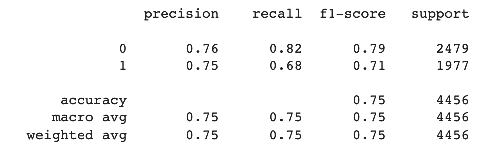
It was a lot better at predicting locations without emergency violations than with violations, but still attained an overall accuracy of about 75%.
In the map, we can see this model still predicts more violations than really exist, but also correctly predicts areas where there are no violations. Zooming in on Staten Island here, it accurately shows the central and southeast parts of the island as having no violations. On the other hand, it over-predicts violation locations in neighborhoods where there actually are violations, like in the north and parts of the south.
The model performed similarly in Manhattan. Like the first accuracy-boosting strategy, it correctly predicted the high likelihood of buildings receiving a violation in northern Manhattan. It also correctly predicted the relative lack of violations in the Upper West Side, Upper East Side, and Lower East Side. Although, as I said, it does still predict that too many blocks have violations than in reality.
While none of these models displayed perfect accuracy, it’s interesting to see how a relative dearth of data - in fact, just two different fields - can make fairly good predictions, especially when you have several thousand lines to train your model on. While I’d never choose an apartment location based on this model, it’s nonetheless interesting to use it to look at building violations across the city.
There are some possible additions you could make to this model as well. You could add census data, block or building history, additional geospatial data, or even other violations (besides emergency violations) into the model to see if any of them improve the model’s accuracy.
While my first foray into machine learning wasn’t without stumbles (at one point I accidentally deleted all the borough data besides Manhattan lol), it was still a fun project displaying yet another use of public data.
As always, if you liked, hated, or have suggestions for how to improve, feel free to reach out - either drop a comment below or email me at lineofactualcontrol at protonmail.com.
And my, um, complicated relationship with this city.
Since I suspect that several Actual Programmers (and/or machine learning folks) follow this blog, feel free to chime in with anything I got wrong!
I’m not going to go into every cell of my Python code (because there are like 30+ of them), but will just show the highlights - if you want the full file, just give me a shout and I’m happy to send it along.


Hi, this is Chris! from Dr. Boncella’s class! Very nice article, your nifty trick made a great movement towards your main goal! Nice usage of logistic regression, thank you for sharing this!
Hello, my name is Diana Martinez-Ponce. I am another student from Dr. Boncella's Data Mining class. When you talked about the confusion matrix, it was a great way to explain it. I was always a bit confused with them but I get it better now. I have heard about QGIS and so I liked reading on how you used it. I was wondering if you had good resources in order to learn QGIS? Thanks ,
Diana