With record-breaking heat in the Pacific Northwest, an early start to wildfire season in California, and temperatures in Pakistan literally too hot for the human body to survive, I decided to start a Line of Actual Control mini-series of posts focused on the global climate emergency. Over the next few months, I’m going to add a mix of environmental stories to my normal fare of ships, planes, and things that go boom (but don’t worry, I’ll continue to use the satellite imagery, data, Python, and social media content that we all enjoy). If you have friends, family, or coworkers who might like that sort of thing, I’d love it if you shared Line of Actual Control with them:
Swelteringly yours,
LOAC
Lake Mendocino is large reservoir tucked away among the redwoods of the Ukiah Valley, almost exactly 100 miles north of San Francisco1. But, like many other reservoirs in the area, its water levels are approaching rock bottom, with the lake only 39% full in mid-June.
Lake Mendocino back when it was full. Credit: Google Earth
In fact, much of northern California is in a serious drought. The water levels of the state’s reservoirs are of particular concern, with Lake Oroville 32% full, Stevens Creek Reservoir 17% full, and Folsom Lake 37% full - and that’s at the beginning of the region’s dry season. The dry weather and rapidly emptying lakes could spell disaster for the state’s agriculture, hydropower, drinking water, and wildfire preparedness.
Meanwhile, on the other coast, I’ve been playing around with Sentinel Hub’s eo-learn Github repository. While I have some Python experience, I’d never really used programming languages to visualize satellite imagery. Could the tools provided by eo-learn help quantify this incredibly dire situation in Northern California?
While the complexity of using Python for satellite imagery initially daunted me, the more I thought about it, the more it made sense. Any image is just a collection of pixels, right? And the colors and associated metadata (like dates and times) of each pixel can be represented numerically, right? If you link those numbers, you can make a list, and if you link those lists you can make an array. And if you can manipulate lists and arrays in Python, I guarantee you can work with earth observation data in Python.
Among the many examples and tutorials on the eo-learn Github page, one caught my eye. It explains how to track the level of a reservoir over time using nothing but satellite images. While the example they focused on was the Theewaterskloof Dam in South Africa, I had something a bit more topical in mind. I wanted to see if publicly available satellite imagery and a bit of Python could be used to visualize the depletion of Lake Mendocino over the last few years.
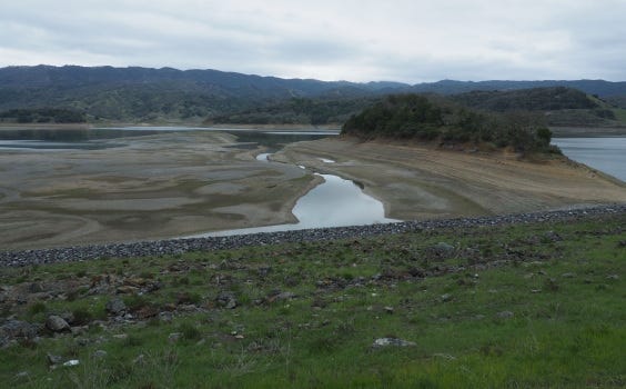
Like this, but from space. Credit: Karen Rifkin, Ukiah Daily Journal
To track the reservoir levels using the eo-learn tutorial, we need something called a “well-known text” file of the reservoir’s boundaries. As I would learn, the boundaries of Lake Mendocino were anything but…well known2.
After some searching, I finally found a California Department of Natural Resources file that contained the coordinate boundaries of every body of water in the state. I imported it into Google Earth, selected the Lake Mendocino boundaries sub-file, saved it as a .kml file, used an online .kml to well-known text file converter, opened the new file in TextEdit to make sure it looked good, and finally saved it as a .txt file in my working directory.
From there, I cracked open a fresh, cold Jupyter Notebook and followed the directions in the eo-learn tutorial. I won’t bore you with all the details of how I can follow basic directions but will instead just briefly review the structure of the tutorial.
First comes the standard stuff: importing some packages to make the code work and defining the geographic boundaries that we’re interested in:
That’s a miniature version of Lake Mendocino drawn using the boundaries from the well-known text file.
Next comes the most important step - defining the data we need from Sentinel Hub and using it to calculate a measurement called the Normalized Difference Water Index (NDWI). NDWI is just a measurement that allows us to differentiate bodies of water from everything that isn’t bodies of water in satellite imagery.
After this step, we define a few other tasks, like excluding cloudy images from our analysis and declaring the time period we’re interested in. For example, here’s the task used to layer the boundaries of Lake Mendocino over the satellite images and convert those images to arrays that can be manipulated in Python.
Once it was all said and done, I slammed the execute workflow button, waited for the code to run, and printed the results of what eo-learn calls the “patch” - basically the geographical area we’re interested in.
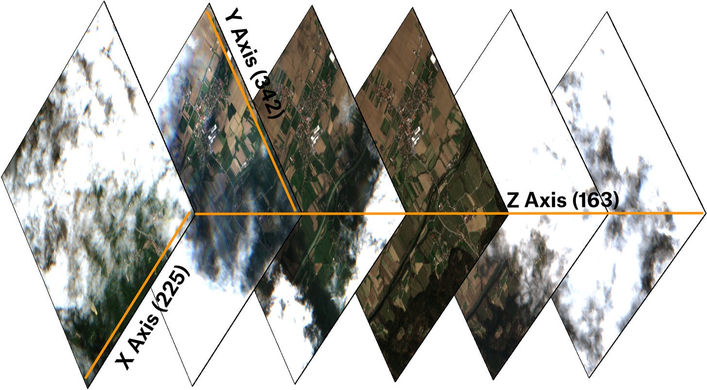
The data contained in the patch tells us a few things, but the most important information is highlighted in blue. There were 163 satellite observations of Lake Mendocino in our time period (which I set to be from January 1, 2018 to June 29, 2021). The 342 and 225 are the number of pixels on the Y and X axis of each image, while the 4 and 1 refer to the number of “channels” of data per pixel we either calculated or received from Sentinel Hub. Using that data and a bit of technical mumbo-jumbo, we calculate WATER_LEVEL, showing the extent of Lake Mendocino in each of the 163 images.
In case you, like me, are a visual learner, the Sentinel Hub blog has a great image showing what we’re doing with the patch over time. Each image of the patch has an X and Y axis (225 and 342 in our case, respectively) and, over time, the repeated images form the Z axis (for us, 163) of the patch’s arrays.
Just imagine that instead of farmland in Slovenia, these images, over time, show a rapidly diminishing reservoir in California.
By the way, here’s what I was talking about when I mentioned the arrays of pixel data at the beginning of the piece. Any of the patch’s arrays can be printed to validate the observations and calculations of your code. For instance, here’s a slice of the array of NDWI values we calculated above:
But if you didn’t get all that, don’t worry - I barely understood it. We’re about to move onto the good stuff.
This graph tracks Lake Mendocino’s observed water levels over time. As you can tell, it’s…not good. While there are always dry-season dips in the lake’s water levels, none come close to the absolutely cratering water levels observed from fall to winter 2020.
(The anomalies in summer 2018 and winter 2020 are likely due to some cloud cover that sneaked through the cloud exclusion threshold.)
While the graph is concerning, nothing compares to actually seeing the lake dry out in front of your eyes. Using the code in the tutorial, I plotted a series of satellite images of the lake from the past few years. I added a red boundary to indicate the edges of the lake in the image and a blue boundary to show the lake’s usual extent.
During the time period observed in the code, the lake was at its fullest in spring 2018. In fact, the lake was actually fuller than its nominal extent at this point, which is why there are virtually no blue boundaries in the image.
During a typical dry season, Lake Mendocino may look more like this image, taken in fall 2018. A bit more shoreline is visible around the edges of the lake and the islands and peninsula at the southern end pop out a bit more.
But 2018’s dry season doesn’t hold a candle to 2020’s dry season, when the lake shrank to the lowest volume recorded during the 3.5 years I examined. That silty puddle is seen here in January 2021:
Worse, the yearly recovery the lake makes every spring didn’t come close to filling the reservoir this year. An image from just a few months ago shows the maximum extent to which the lake was filled this year.
Needless to say, the visible shorelines and receding waters do not bode well for the reservoir’s health, especially in comparison to the volume seen during more typical springs, like in 2018. In fact, the graph shows that the lake’s water levels have not only peaked for the year, but are already dropping amid scorching temperatures and the region’s thirst for irrigation and hydroelectric power.
Unfortunately, as the climate continues to warm, years like this will only become more common for Lake Mendocino and other reservoirs, lakes, ponds, rivers, and streams throughout the American West. And while this shrinking reservoir may just look like a smaller and smaller body of water, we must remember that the lake’s decreasing volume has real implications. Farmers must contend with drier fields, power cuts may be more likely due to the decreased reliability of hydropower, residents of the area may face greater water restrictions, and the likelihood of wildfires will increase while our ability to fight them may be diminished.
I hope eo-learn and the case study of this tutorial shed a bit of light onto the water woes of northern California. Tune in over the next few months for more environmental stories (not all as grim as this one, I promise!) from your friendly neighborhood Line of Actual Control.
When I lived in northern California, I would go hiking just southwest of there. It’s one of the most jaw-droppingly beautiful places I’ve ever seen.
I’m so sorry.


